Web accessibility, as the phrase suggests, means making your website accessible to your users. Consider the problems and types of users that come across your site. It means being inclusive for the people who are differently abled or have some kind of impairment (visual or motor) and making adaptations to your site to make it easy to use. You should have tools and technologies to provide facilities to differently-abled people, so they have equal opportunities to access the content on your site. For instance, provide zooming in and out options for people with vision impairment or provide more keyboard navigation control for those with limited mobility or impaired motor control, to name a few.
Web Accessibility Checklist
Web accessibility checklist means the criteria of evaluation. There are guidelines called Web Content Accessibility Guideline (WCAG) to help make web content more accessible and provide an inclusive and single shared standard. The first edition focused more on technology that could help provide accessibility, chiefly related to HTML. Successive versions focused more on principles of accessibility, making them more adjustable.
WCAG 2.0 is a widely accepted set of recommendations. Revised 508 Standards are based on WCAG 2.0. This version is based on four main principles of accessibility which are known by the acronym POUR. It stands for Perceivable, Operable, Understandable, and Robust.
Perceivable:
It means that the user can identify the content of your site by using senses. Not everyone sails on the same boat. Users can be diverse. Some can perceive your content with the aid of visions; some may require you to use other senses like sound or touch. Similarly, the language barrier makes it hard for some users to perceive the content. Therefore, it is advisable to incorporate tools and techniques that can make the job easy, such as having scalability options for the text and using symbols in your context. You can also provide the ‘reading the text out loud’ option or use different background colors to differentiate between the text.
Operable:
It means providing more control and better navigation options for the users by integrating keyboard control, voice recognition, and a screen reader, to mention a few. There are many people who have less control over their motor functions, low vision, or no vision at all. For these people, it can be hard to use a mouse in order to explore the site. Henceforth, it is suggested that you accommodate them with the keyboard control so that they can explore your site without difficulty or provide voice recognition. Likewise, provide your users with the option of a screen reader so they can hear the screen’s content without interruption.
Understandable:
It means that the user is able to understand the content on your site. As your user might not understand English well or is unfamiliar with the acronyms or phrases used in the content, it will most certainly become difficult for them to understand, or they might not be well-trained to operate your site to move through it. To avoid this problem, it is recommended to imply simple language, define the acronyms and phrases for better understanding, and design your website in a way that the users do not need to relearn the navigation. Make the content clearer and help users in avoiding and correct their mistakes.
Robust:
It means that the content should be put in such a way that a majority of the users can reliably decipher it, and they should be allowed to choose the technology to interact with the site to access its content. For instance, some sites require a certain browser to be accessed, or a certain document is unable to be accessed through a screen reader. These hurdles can be avoided by simply making your site compatible as much as possible so that it can be accessed by the users’ present and future tools and technologies.
WordPress and Web Accessibility
WordPress is an online platform of Content Management System that allows users to create and host a website or an online store. Initially released in 2003, it contains plugins, themes, and templates to help you customize your website, portfolios, blogs, etc. Therefore, it is very important to understand the tools of web accessibility on WordPress to adapt your website according to the recommendations of WCAG 2.0. It became necessary to follow the guidelines after the Americans with Disabilities Act (ADA) was passed.
Regarding WordPress, accessibility could be disorganized, no matter how much evaluation of the themes, plugins, and software is done by the WordPress Accessibility Team. It is largely on the developers and content creators to select their accessibility tool kit. This practice will help attract more users to your site and create an amazing experience for differently abled people. The following are some of the factors that you should take into consideration when creating your website:
Navigation:
As mentioned earlier, navigating your website should be easy for all kinds of people. Nobody should be held back because of any kind of disability, like visual impairment or decreased motor function. Your site should be navigable using any device, i.e., mouse, keyboard, and assistive technologies.
Alternative (Alt) Text:
Users accessing your website can be of different backgrounds, and they might face difficulty in understanding English, or they could be visually impaired. Hence, it is better to use images and symbols in your text and have descriptive content so that it can be accessed through screen readers.
Colored Text:
Approximately 7 to 8 percent of the global population suffers from Color Vision Deficiency (CVD), also known as color blindness. It could be hard for them to read the content. It is highly advised to use different colors and contrasting shades so that such users can differentiate between paragraphs and read the text more easily. But make sure to avoid using such colors (commonly red and blue) that cause seizures.
Font Size:
We have seen older adults suffer when reading on the computer or mobile screens because of their low vision. Therefore, it is preferable to use a large font size for your text to make it readable for everyone. Also, use a comprehensible font style for the content.
How to make your WordPress site more accessible?

WordPress will be a widely used platform by more than 455 million people by 2021. It is necessary to know what steps or tools can be used to make your website meet the guidelines of WCAG 2.0. Some of these tools and steps are as follow:
Choose the correct WordPress Theme
WordPress provides you with many free and paid themes. Most people might be inclined towards the free theme for their website, but they might not necessarily be user-friendly. When creating your website and selecting a theme for it, you should be considerate of all kinds of people. For instance, if you select a theme with similar colors, that can cause difficulty for people with Color Vision Deficiency, or if you choose a theme with colors that can trigger seizures can also cause problems. Therefore, it is necessary to be careful when selecting the theme for your website.
Some of the basic features which you should look at before deciding on the theme of your website are:
- Keyboard navigation
- Reasonable HTML heading structure
- Contrasting color scheme
A simple way of doing this is by going to the Theme Directory, clicking on Feature Filter, and selecting Accessibility Ready.
But not every theme does not have to have accessibility features to meet the needs of a diverse group of people. They only have a bare minimum. So, it is upon you to make sure your site is suitable for differently abled people.
Attach Functional Features with Plugins
When creating your website, you can simply use WordPress accessibility plugins. Install a WordPress plugin and boost the accessibility of your site automatically without performing any maintenance. There exist two types of plugins in WordPress:
- The first type helps you create accessible content, to begin with.
- The second type helps you transform the existing content into a more accessible one.
By using the right filter, you can imply with the WordPress ADA. When in the Plugin Directory, use the accessibility plugin tag to browse for results.
You can enable the option of skipping to the content through the keyboard and use the color schemes with negative contrast, light background, or gray-scale options.
Alternative (Alt) Text
Images are an integral part of the content of your website. They kept the audience engaged and made it easier for people to understand the context better. But when a user uses a screen reader, he needs something to be read because images are not words. Therefore, it is a good practice to provide Alt text or description of the image, which the screen reader can read, and they can have the same experience as any other user.
It can also benefit you when using WordPress SEO because a search engine will use them to return the search results.
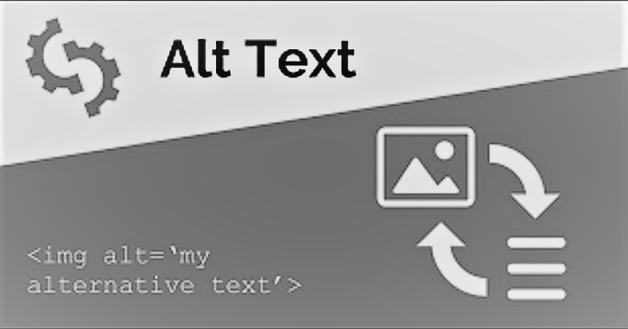
You can use WordPress to assist you with Alt description. Simply head to the Attachment Details tab on the right side of the page. You will find many options like title, caption, description, and alt text. The alt text has a word limit of approximately 125 characters; make sure to write the description within the word limit. A bonus point is to use target keywords so that the search engines can use them to return the search results and improve your ranking. If you want to provide more detail about the image, you can use the captions for that purpose. It will help your site be accessible to people with impaired vision to understand the content more. WordPress also has the accessibility plugin Bulk Auto Image Alt Text that automatically adds alternative text to multiple images.
Use Comprehensible Fonts
Font style and font size are two major yet simple things that can make your content readable. An unclear font style or a smaller font size can make it difficult for many people to read your text; hence it comes under accessibility problems. Many content creators look past these facts to make their text stylish and end up using cursive fonts. But to avoid the problem of readability, it is better to use Arial, Calibri, or Times New Roman fonts.
Similarly, use a font size of 16 pixels when writing the content. Moreover, provide the option to zoom in and resize the display to help people with limited vision. You can use the Site Editor when using the block theme to edit your fonts. Go to the Appearance tab in your WordPress dashboard, click Editor and select Typography. Then click on the text element, which will open many options to customize your font style and size. Use the Zeno Font Resizer plugin to enable resizing the font.
Select Contrasting Colors
People with Color Vision Deficiency (CVD) are not able to see some colors, and it is hard for them to differentiate between similar colors. Therefore, choosing a contrasting color scheme for your website is important. The majority of content creators prefer white backgrounds with black-colored text because it is most easily distinguishable. WordPress has a feature to notify its users when they use a similar color which can be difficult for people to read. And it will also suggest the right combination possible.
Add Headings
To make your text more understandable, it is better to split it into paragraphs, each containing a suitable heading. Having to read a lengthy text makes it boring and tiring for the readers. Hence, heading can help in having people’s attention throughout. There are many people who have learning disabilities, and headings can help them understand the passage better. You can use WordPress Block Editor to add headings. Just go to the Heading block and select the size you want for your heading. You can view if the size you choose for the heading is appropriate or not. WordPress also sends alerts if the heading is on an incorrect level.
Use Appropriate Anchor Texts
You might need to add internal or external links to direct your audience to different web pages in the text. You have to tag those links as well. These tags are called anchor texts. But someone using a Screen Reader will not get the idea of what the link is about. Therefore, it is advisable to use appropriate anchor texts. For instance, if the link is about information on dog breeds, it is better to tag it with dog breeds so that the screen reader can read it out loud and the user can have an idea of what they are clicking on. You can add a short description of the link as well.
Add Captions and Transcripts for Videos
Transcripts mean a written version of something that is in audio form. When uploading videos on your website, you should enable the transcription feature so that people with hearing impairments can understand the video. The translation feature can also help people with different linguistic backgrounds understand the video. Hence, communication will be easier when there is a language barrier.
How To Test The Accessibility Of Your Website
When you have created your website, and it is ready to launch, it is better to test the accessibility of your site. One way of doing it is by running automated tests. For that, you have to run your website through an accessibility evaluation tool to check its performance.
Although the tools are very helpful, they might not be able to catch every accessibility error. You should test your site manually. For this, you have to put yourself in the users’ shoes. Go to the front page of your site and, grab the users’ lens, start scrolling and navigating through the content. You should see if any potential elements are flashing or moving in a way to distract or confuse the users. Check for your site’s color scheme and the font size and style of the content. Try navigating using the keyboard. Use different accessibility tools like a screen reader. Check the display resizing feature as well.
After testing the website manually, correcting all the errors, and launching the site, you might also want to collect user feedback and keep improving as much as possible to keep your users engaged.
We are living in a time when everyone should be given an equal opportunity to access everything, and their differences should not become a hurdle in their path. Web Content Accessibility Guidelines are here to make sure that everyone has a shot at the content they want to access. Your site should be perceivable, operable, understandable, and robust. You should try your best to meet the WCAG 2.0 so that you can have an improved ranking and happy users.